CASE STUDY
B2C Real Estate App
Homes.com is the second-largest real-estate platform in the US.
I designed a new onboarding experience, key features, pattern library and color palette for the mobile app re-design.
Impact
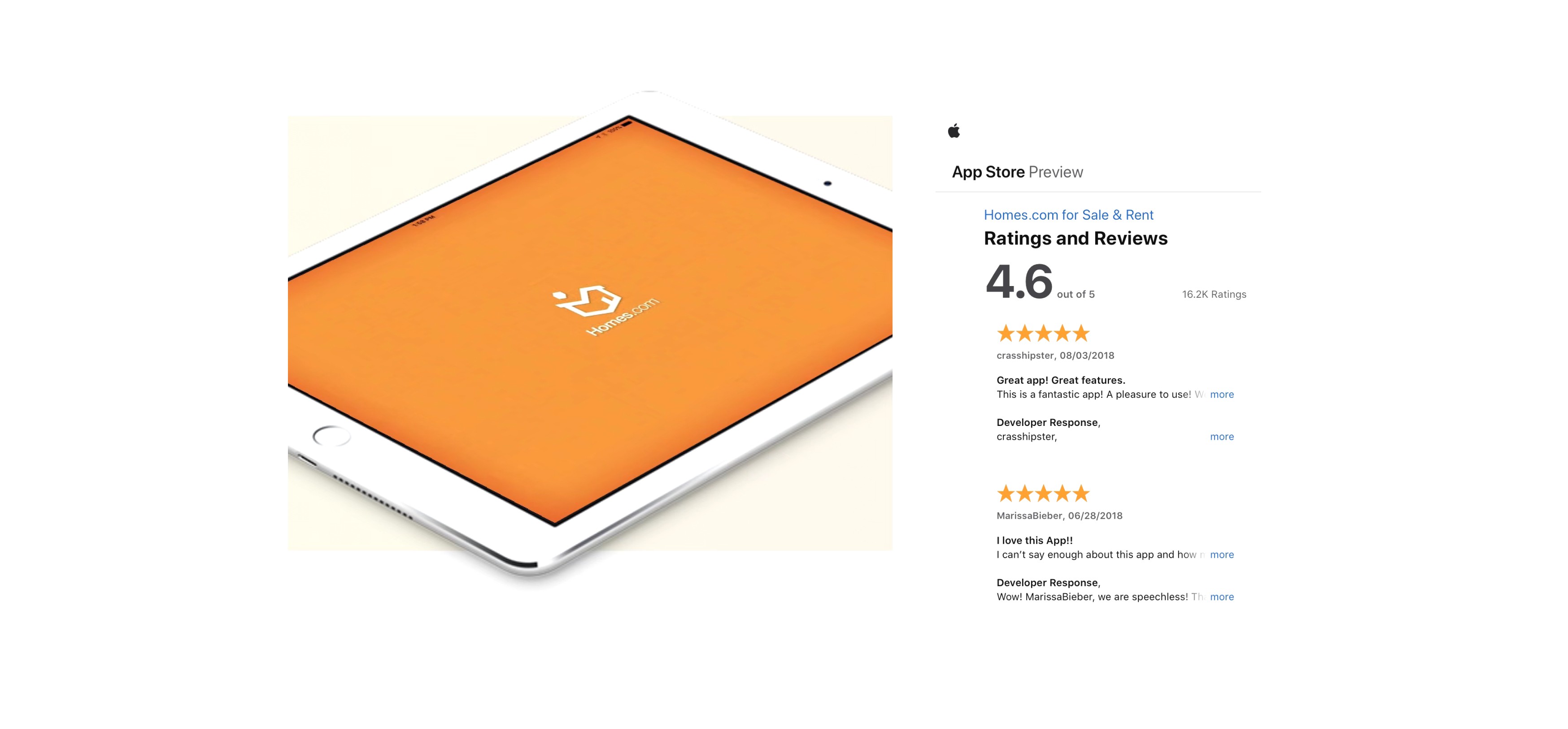
App version 9.6.0 launched in 2017 featuring improved usability and an average rating of 4.6 out of 5 on the app store.
Role
UI Designer
Team
1 × product manager
1 × UI designer
3 × engineers
Year
2015
Process
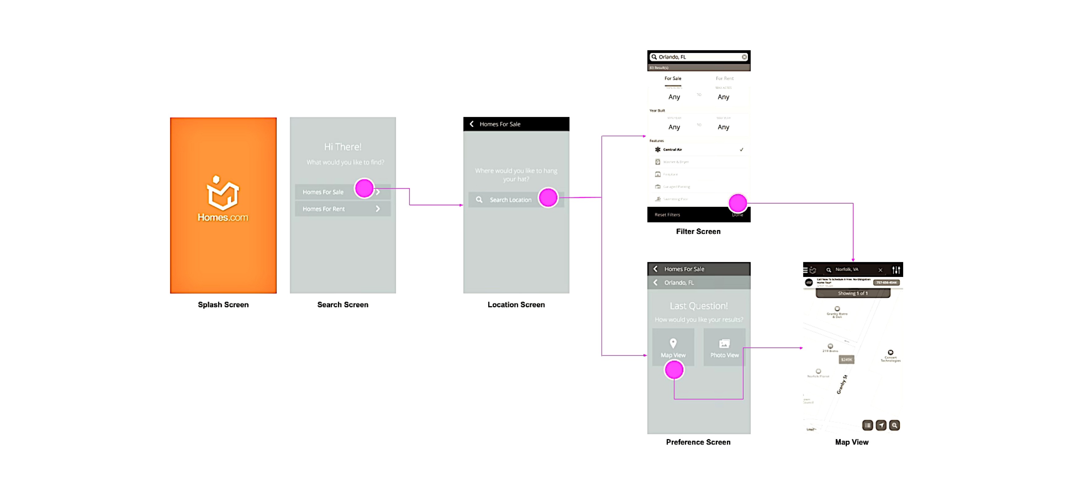
Prototype and Test
To provide users with a more dependable experience, we focused on areas where they where experiencing negative emotions and documenting areas where navigation seemed incoherent.
View InVision prototype.
Collaborate
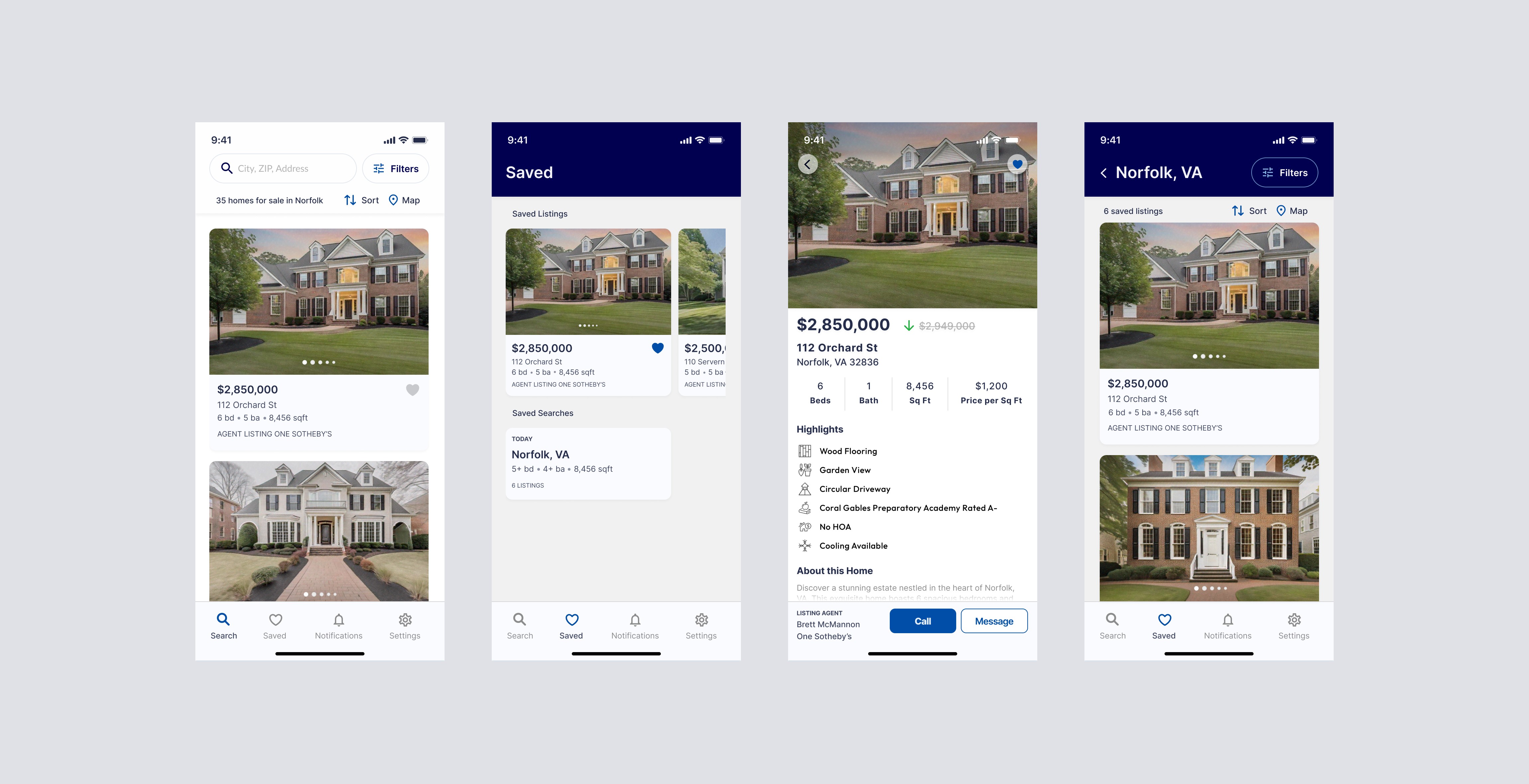
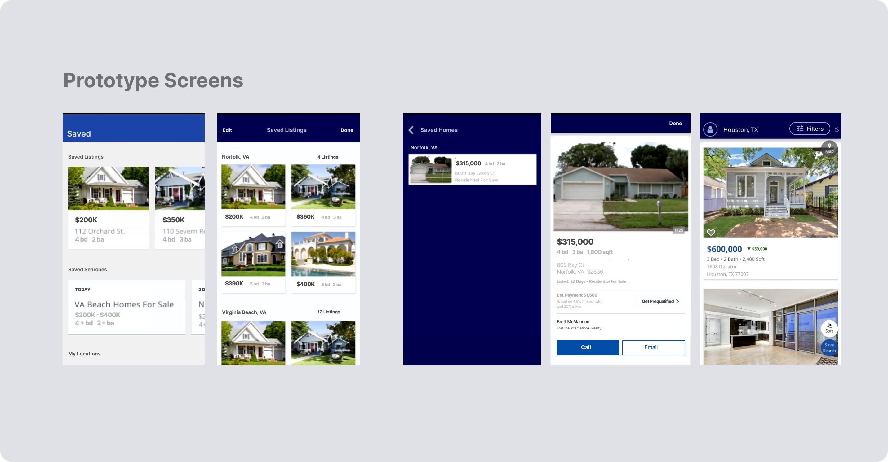
Enjoying full ownership of the product, I worked closely with the product manager to completely redesign key app features such as the brand’s mortgage calculator.
I also collaborated with designers and developers to create a design system with code components housed in Confluence to align with Jira, which was being used by the engineering team.
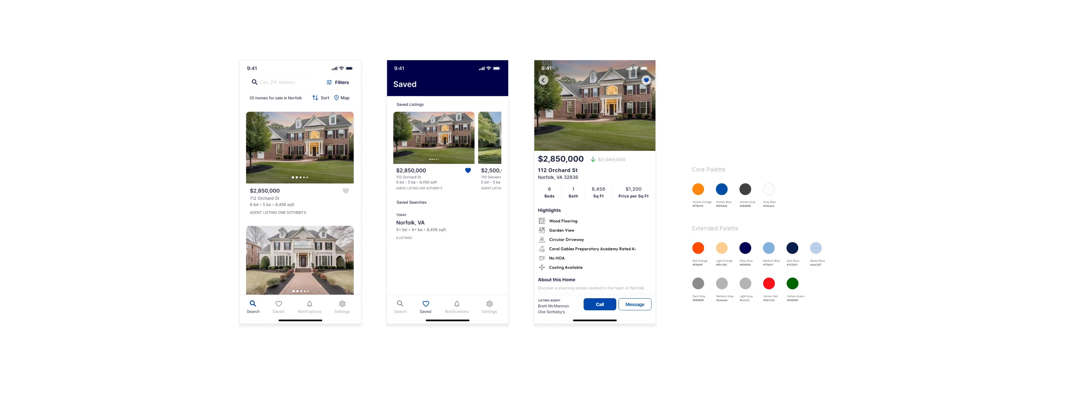
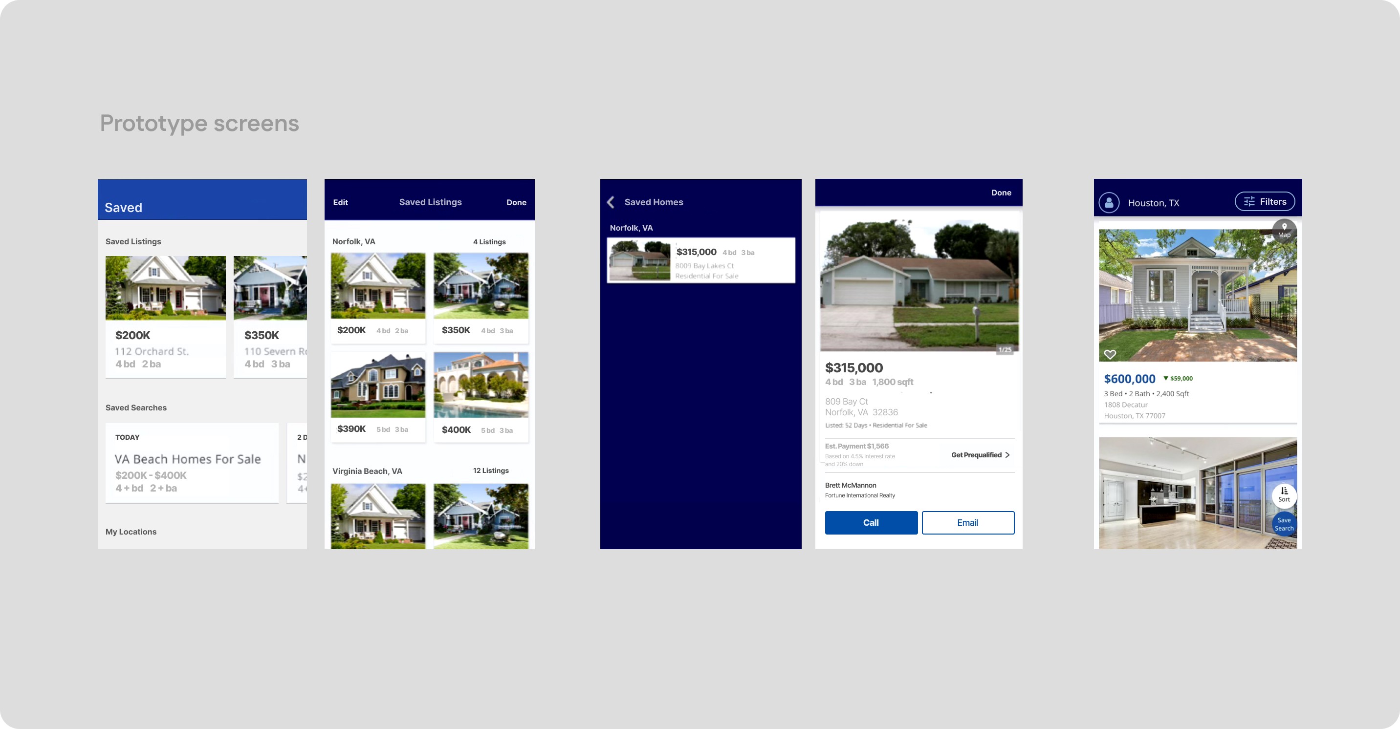
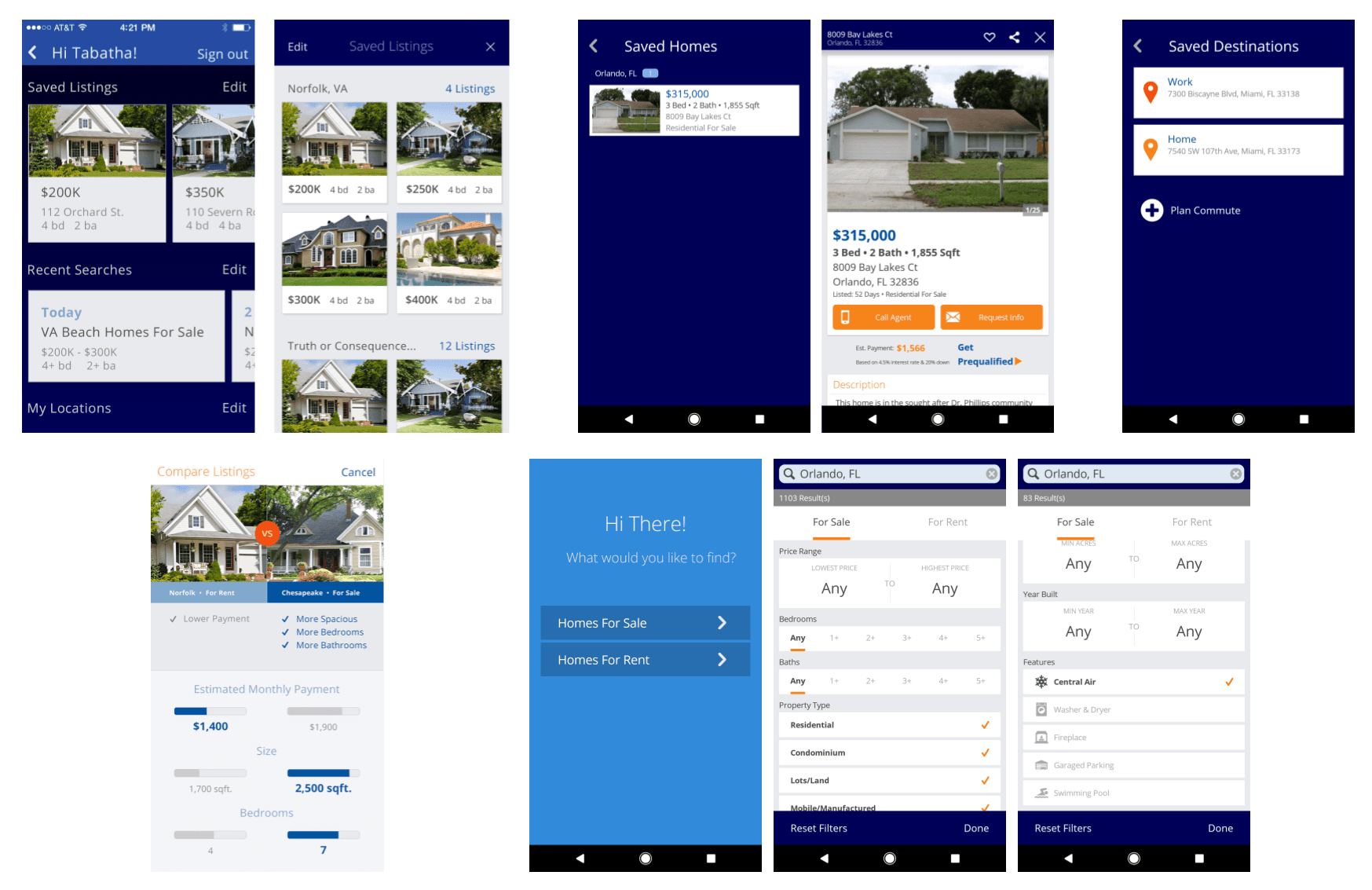
Design Refresh
I designed a new pattern library and color palette for the mobile app re-design. Color decisions where based on the two key brand traits identified during ideation - Dependability and Fun.
The primary brand color is orange, representing the optimistic character of the brand, but the core palette felt dated and I implemented an extended palette of oranges, blues and neutrals along with red and green for alerts.

Improved usability
App version 9.6.0 launched in 2017.
The outcome was a released version of the app that boasted useful home purchasing tools in addition to a:
robust search experience;
improved user onboarding;
improved UI.